Information required is done.
Artist is promoted well.
Continuity through poster and DVD is good.
Spelling of blue is incorrect on the back of the DVD.
The band name is hard to work out on your digi back.
Digipack feedback
DVD Cover;
The use of the picture on the front helps to identify the artists and thus sells them. nice flaming A. The use of the colour grey and similar themes are kept throughout the digipack features eg. font keeping it easy to recognize.
Magazine advert;
The tour dates are very clever as they are selling the artist and are original but as its a magazine cover, it doesnt really work.
Digipack Feedback from Group 45
Both the DVD cover and magazine advert have continuity with your music video. We like how you have included different pictures on the digipack. We think that the magazine advert is not as strong as it could be as we feel that it might have been better if the image was the main focus. However we like that you have included tour dates which no other group has done. The DVD cover has worked better than the magazine advert. We like the small picture included on the back and the font used for the titles. The placement of the logo's are a little bit random but if you had more time this would have been something you could have thought about a bit more. Overall a good job, well done :)
feedback
Has Info, but is slightly confusing with different pictures of stuff, also there isn't any websites or when it goes on sale, also its a tour poster not a 'DVD on sale' and does not include any numbers/websites on where to buy tickets from. Promote artist really well as there are clear picture of the band on each product. All have continuity with artist being shown, record label on each, colour in the background, but doesn't have a obvious link to the video.
Friday, 27 November 2009
Digi-Pack turn out
I think the roundabout feeling within the group is a little disappointed. The outcome of our digi-packs really aren't what they had the potential to be, due to lack of time we had left ourselves to hit the deadline. None of us really were that successful in trying to overcome photo shop either which helped slow us down a considerable ammount whilst frantically trying to put our advert and cover together. All in all the final hurdle was a bit of a let down and if we had planned our time better we would have seen some better results.


Monday, 23 November 2009
Digipack Preparation
The deadline for our Digipack is Friday 27th November 2009, giving us 4 days to finish all our final products. We've decided our shooting will take place on Wednesday 21st November. We have two strong ideas for our digipack, fortunately they're both at the same location so the shooting can be faster and beneficial. Our first idea is to stand the band against the advertisement board outside the junction. The wall highlights all the major upcoming music events in Cambridge, this would be more than appropriate to our music video because the theme of publicity and commercial success is present. The band are trying to be sold by showing their lifestyle in the music video and now it shows their devotion to the industry and friendly relationships through one part of the digipack.
 This shoot will take place between 10:30 and 12:20 on Wednesday 25th November.

After capturing test pictures in class today we found that for this particular shot, a camera with a fish eye lens would be better. It can capture more of the advertisement board without changing the frame of the artists and shows that the band are the centre of attention in this album cover. The band stand out better and immediately grab the attention of a viewer. The picture below shows the difference a fish eye lens can have.
 This shoot will take place between 10:30 and 12:20 on Wednesday 25th November.
We feel this shot would work better as the DVD Album Cover part of our ancillary task.
Furthermore, our second idea was described in the blog 'Digipack Development', it would work better as the magazine advert part of our ancillary and would show the band walking. The final image will try and give a celebrity effect and a paparazzi feel and will try and boost the celebrity status and reputation of the band. In todays lesson we took test images to try and decide on the correct positioning of the camera and artists. These are our results:

This first picture was positioned around five meters away from the band as they gradually walked towards the camera.
We felt it gives the right impression and does show the paparazzi feeling we're after.
We also felt the band didn't incorporate enough of the image. Next we tried the same layout but the image was taken when the band (excluding the drummer) were closer to the camera and the overall distance between the lens and the artists was smaller.
 Next we tried the same layout but the image was taken when the band (excluding the drummer) were closer to the camera and the overall distance between the lens and the artists was smaller.
We felt this achieved the aim of capturing celebrity status and this time the band fill the frame better.
We also felt the were too close to the camera, and that had this been a paparazzi camera the artists would try and keep their distance.


These last two images fill the brief a lot better. The distance has been kept but the artists still fill the frame. By giving a slight zoom the angle of view has been altered and give the pictures shown above. This setup has been noted and will be used on the day of our shooting. The camera we'll use won't be a fish eye. We're waiting to hear back from the manager of the location for final permission to shoot this shot so the location has not been finalized as a posed to the DVD album cover. Finally, we need to bring an extra person to the location so we can capture the pictures while all the band members are in shot.
Filming prep (late post)
This is a photo of the lighting from when we filmed at the lockup. We stood each band member against a wall and then filmed them playing the whole song and extracted parts to put in the main video. You can see from the positioning we were aiming to get close up and med shots of each member.


Thursday, 19 November 2009
Digipack Example
 This album cover for The Kooks could be used as a template for our digipack. The genre is the alternative rock/indie rock which is the same as our music video, therefore we could use this album cover as a stimulus for our DVD pack.
In our digipack we're aiming for commercial success and maximum recognition for the band members. The digipack also needs to be a brief summary of our music video so they viewer can have a 'sneak peek' of the product. This alone will also sell the artists because much of our video incorporates an insight into the lifestyle of the artists.
After group discussions we have several possibilities for an album cover. These include a group logo/the junction idea/a screen grab from the music video. However, theres more to an album cover than the front image. This could be a barcode from the shop, a track list, the logo of the record label. Theres so much variety to chose from when selecting ideas for our album cover, such as font/positioning of title/ratings/the front image itself etc. These are some ideas for possible fonts.


DVD Cover Ideas
 For our Digi pack we need to include a DVD cover and a magazine advertisement, above is the Album cover for busted. We chose this band because we feel they conform to the traditional rock formality, although we are aware that our msic video is alternative rock and Busted are more pop rock we still feel their Digi pack is appropriate to use as guidelines for ours.
To grab the viewers attention we need to:
- Include bright and catching colours
- Include good reviews from well known Critics i.e MTV etc.
To advertise the product we need to include:
- A Brand name
- A Release date
- Where it canbe purchased
- And official website such as a myspace or facebook page
- A Label with a good reputation
Extra Features that could be included would be:
- Promotional videos
- Bonus tracks
- Live Footage
- Tour Info
- Ratings
- Behind the scenes Photos and footage.
Dvd Cover, Magazine Advert By Karl
 For our project it is a requirement for us to include DVD cover and a Magazine advert. For us to get an idea we need to look at existing examples to get a good idea.
This is the Album cover of the album 'Alexisonfire' by the band Alexisonfire. This album cover is for a slightly heavier genre of music than our piece. It does meet expected genre characteristics because it doesn't give much away and leaves the audience guessing about the content of the CD, Only existing fans will know. This however does look intriguing to new fans as they will want to find out more about it. There is a clear band name in easily readale format on the front which does premote the artist.

Across is the poster advertising the Vans warped tour 2009. This could be an example of what we're going to use but to promote our Dvd instead of a tour. This advert is good because it uses lots of bright colours. It gives the neccasary information and highlights the important parts.
Digi pack example


 This example of Bloc Party's album: Weekend in the city shows us some ideas that we could use on our own digi-pack. Although the genre of music is different we could at least take from the layout of the album cover and side.
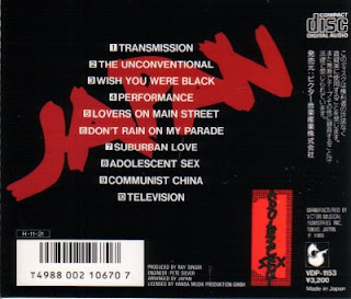
Our ideas are more band focused than this though and it should achieve public promotion through the band picture on the front, not only will the audience enjoy the music but they will also know each member and who they are listening too. Of course another possible idea would be to put out a logo that would be recognizable among fans like Lostprophets do on their cover of "Liberation Transmission"
 These ideas we could fit onto a DVD cover as well, but you'd expect to see more things such like tour dates and ratings from separate publications written on the back, and on the inside covers. here's an example of a DVD cover that will vaguely relate to ours.
 The title on this DVD cover gives us more examples of what we could do with ours, maybe create a font that is band specific. After looking for the band A's pictures we can see the pattern of text that we can try and imitate on our own digi-pack.
 Even though the Flaming A is not really to our taste imitating would be our best idea to make the digi-pack look professional. And in fact as you can see, this front cover is pretty much what we are going for with ours apart from we don't want to have the effect they do. We want the images to be naturalistic so the members are easily seen. But we have a lot of ideas to contend with when creating our digi-pack, and we also have some photos to take.
Another thing we have to think about is special features here's an example of special features from another DVD

We could have things like:
-Band Commentary
-The shooting of the video
-Lyric sing along
-Pre-Production
These are all things we can consider when producing the back of our DVD.
 A photo like this is what we'd be going for for our digi pack. We wont be using this one as we want to have a proper photo shoot with a better camera, but something that catches all the band, without instruments, behaving how they would in everyday life, but we might experiment with posing pictures also.
Feedback from group 37
The rock genre fitted well with the video and suited it very well.
We thought the in screen shot of the drummer was very good and created a good effect. It also had a very similar angle of famous rock videos currently.
The live atmosphere made it suit the rock genre even more.
The transitions and cuttings were very effective and flowed well.
The lip syncing was well done and synced.
The overall feel and effect of the video was very professional and we thought attractive to a select audience.
Wednesday, 18 November 2009
Feedback on Final Cut
Feedback from Group 44
> We're guessing it was a rock genre and it worked very well. You had performance shots with a bass and a guitar with drums and of course vocalist. The shots you used worked well.
> You have done a lot more work on your lyrics and visuals and it has paid off. Close ups of JJ singing the lyrics works well.
> Music and visuals such as the cuttings are very well done.
> The demands of the record label are met. This is through the use of close ups of the artist and performance shots.
> The notion of looking gave an impression of looking into their lives.
> Intertextual reference to some ideas like the box idea.
Feedback from Group 45
> We really like this video because it kept us entertained and we wanted to watch to see what happened next. A lot of the shots were really funny, we especially liked the one of all of the band coming out of the box because the editing is so good that it makes the viewer believe that you are all coming out of the same box.
> The video fits in really well with the genre characteristics. The genre of the song is rock and we see a lot of stage performance along with narrative. The narrative is effective because it shows the band all having fun and messing around.
> There is not much link between the lyrics and visuals however there is a strong relationship between the music and visuals
> Overall the video is very effective and we can see a lot of hard work has gone into producing it.
Feedback from Group 47
> Genre conventions: Follows the characteristics of rock music video as it has a stage performance and is like a documentary of them on the road
> Also had dance routines which is in lots of existing music videos.
> Lyrics & Visuals: No obvious relation to what the lyrics were saying to what they were doing on screen.
> Lip Syncing was good and consistent throughout.
> Music & Visuals: Band use instruments that are relevant to the genre & song (Drums, Guitar & Bass guitar).
> Demands of the record label: Lots of close ups of the artist & Band. Majority of video had band in.
> Voyeurism: Not a lot of voyeurism as it was noticeable that they were all aware of the camera, even the extras being filmed.
> Intertextual reference: No real reference to other music videos, films or TV programs.
Monday, 16 November 2009
Digipack Development
Now that our music video has been completed and submitted, we have until Thursday 26th November 2009 to create our digipack. This consists of the album cover for the music video and the magazine advertisement. To have an effective digipack there needs to be a running theme through them both, this gives a signature to the artists and viewers can relate the magazine advert to the album cover or vice versa.


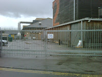
Our initial ideas for the album cover included ideas around positioning of the band and possible finishing effects. However, there wasn't much thought about location or themes. After a small discussion in class and some previous research we decided to request permission to capture our shots at 'The Junction' in Cambridge. This would be suitable because its an entertainments facility that includes several performance spaces and often holds large music events. The rear exit of the venue is a stereotypical backstage space, there's often a large touring bus and large stage doors as well as a metal fence surrounding the area. This is appropriate because our band would be familiar with these areas as they're a touring alternative rock band and using this location will show this to the viewers. There is a picture of this below.
 Using the junction as our location would highlight the celebrity status of our band and could be used as a theme for our magazine advert. We brain stormed ideas that included having people posing as paparazzi and the band wearing sun glasses to suggest the reputation and fame of the band.
 Using the junction as our location would highlight the celebrity status of our band and could be used as a theme for our magazine advert. We brain stormed ideas that included having people posing as paparazzi and the band wearing sun glasses to suggest the reputation and fame of the band.

A brilliant place to start was to look through women's lifestyle magazines to find a picture that was similar to our idea. These were the pictures we found:
This picture is from LOOK magazine and shows a long shot of two celebrities. This is the kind of shot we were looking for as it shows the whole body and is taken from afar.

Next is a snapshot from MORE and shows two celebrities, this time from a closer angle. We can compare and contrast the images so far and decide on the angle most suitable for our digipack.

Finally we have a picture from a HEAT magazine. This also follows the conventions from the pictures above and is exactly the type of picture we're aiming for.

We can see already that the lighting will be naturalistic and the frame will include all of the artists and all of their body. Further testing at the location will decide camera positioning and blocking for the artists and other actors. Overall we will give out professional reputation and an underlying theme of fame and publicity could run through our digipack. These are only our beginning ideas and further research and decisions still need to be made such as possible finishing techniques. A brief idea we had was to put a camera filter over the picture giving it the impression its been taken from a camera and shows the naturalism in the shot, whereas without this filter it could suggest an insight into the band leaving the venue. This could be like the filter used in Lady Gaga's Paparazzi music video.

Wednesday, 11 November 2009
Penultimate Editing lesson
Today is our second to last editing lesson. So far we're looking good to be completed on time for our deadline. Our main tasks today have been to complete the lip and instrumenting syncing. After this was completed we've just been generally ordering our clips and moving all the clips onto one layer to make them easily viewable. With all the clips on one layer it is easy for us to select just the clips we wanted. Our goal for this lesson is to have all of the clips in the correct places and order and then for our last lesson to add all the filters and effects.
Tuesday, 10 November 2009
After Hours Editing
Today our whole group came into college after hours to try and catch up with our editing. We started by sorting all of our good usable footage from our poor footage, once we had done this we started to lip sync our video. By placing markers on the actual song we were able to clearly see where each of the chorus' start and the distinctive lyrics. then we did the same with the video (still attached to audio) and simply lined them. We have sped up the footage of all four band members climbing out of a box to hide the jumps were each person climbs in (camera has been paused while recording for this). Tomorrow we hope to perfect this for our final deadline on monday. When we will hopefully begin our digipacks [Albums and DVD cover].
Monday, 9 November 2009
Filming at the "Secret Location"
We went to take some test footage on site to gain some ideas of what we could do extra on hen we next filmed at "The Lock Up" and we stumbled upon a secret location. Here we managed to get some photo idea's for our digi pack, and we also took some footage that we may include in our music video of us all climbing from a box. The footage will only be a few seconds long but it adds an extra bit to the band lifestyle section of the video.
we made it look as if we were all climbing out of the same medium sized box by choosing when to stop and roll the camera, and by using this technique we were able to make it look as if we had all started in the same area.
we made it look as if we were all climbing out of the same medium sized box by choosing when to stop and roll the camera, and by using this technique we were able to make it look as if we had all started in the same area.
Final Cut Progress
 This is what our video looks like in the editing process right now. We have a lot of out of place footage and a lot of unused sound, although when we convert it to quick time this wont cause any problem. We need to sought out all the footage that we're using add effects and lap over only when we need to.
Sunday, 8 November 2009
Feedback from Target Audience
In revising our pitch on the target audience, we could chose an appropriate viewer to judge and comment on our progress so far. In our pitch we specified that our market would be to "Teens and 20+". Therefore, we picked to suitable viewers and asked for some input and feedback on our rough cut video.
Our first was Gareth Hyde.
Profile of Target Audience These give us a better understanding of what needs to accomplished in our final days of filming and editing. Once we've collected all our footage we will show our work to an expert for professional feedback.
Thursday, 5 November 2009
Test Footage 2 (scott wrote this)
After evaluating our existing footage and our feedback from our teacher and other groups, we felt it necessary to obtain more band shots and close ups. Consequently we ventured around long road and found a secluded location and set to filming.
We feel these shots may be used to fill some of our gaps and will help to build our band image and could be evolved in our digi pack. Our footage includes us walking down a set of stairs (leaving the stage) at several different angles which evolves continuity. And a continuous shot of all four band members climbing out of a box as if we were all in there together.


Location Angle Shot Settings
 We had to decide on the angles of shots at the location. To take full advantage of the lighting system we had at our discretion at Sawston Village College, we took ideas from previous music videos that used a stage performance or concert (as shown in the Moodboard post) and produced a professional looking shot. From the drawing of the location below it shows the eclipse we made between the colour scrolling light, the artist and the camera.

To give the right effect, the light (pictured above) had to be kept at
a dimmer setting so that camera could detect the artist.
This gives a silloette impression of the artists and shows the performance side of the music video. The area covered by the colour scrolling light is shown in the drawing. The picture below is cut from our rough cut and it shows the effect given.
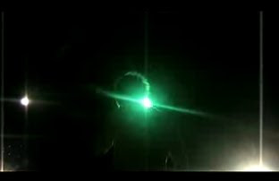
This gives a silloette impression of the artists and shows the performance side of the music video. The area covered by the colour scrolling light is shown in the drawing. The picture below is cut from our rough cut and it shows the effect given.

Contradictions
From our feedback from Holly, and other groups we have had contradictory views on our locations and shots. Some say we have to many locations, and other think the contrary. Also some think that we have a wide variety of shots, but upon looking closer i think most would agree that most of our shots are long and medium. So to overcome this we have decided to edit some of the street footage in final cut, to zoom in on the faces of band members, or just edit them so they appear as close ups on the final version. We also are going back to the lockup to get more closeups of each band member to add to the video.
With these things put into action we hope the overall result will look a little more professional, and contain more variety.
With these things put into action we hope the overall result will look a little more professional, and contain more variety.
Wednesday, 4 November 2009
Location Settings
The following drawing shows the space we were provided with at Sawston Village College, it shows both the stage and the auditorium in the hall. The four artists have been marked with a single black dot and the camera symbols represent the direction and position of the camera when we captured our footage. The shaddowed sections reveal the area the camera can see. Most of the shots drawn on this plan map the shot movements, we decided on these before arriving at the location because we knew these would be the trickiest to capture. Camera movements are mapped by two crosses joined with a straight line, there also some rough measurements between objects and the camera.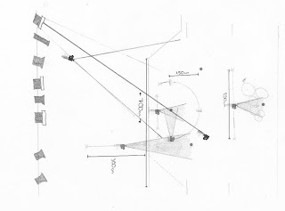 The blocking was simple when it came to artists positioning on the stage. The famous conventional layout of an alternative rock concert is prominant in every stage music performance due to the musical requirements on a stage, this means keeping the drumkit upstage so that the vibrations can resonate with the space above the stage and doesn't drown out the sounds of the other instruments. An example of this layout is used in the final performance of 'The School of Rock' as pictured below.
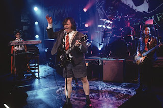
The lead singer is at the front, leading the piece and the two guitarist are kept slightly upstage, either side of the singer.
 The blocking was simple when it came to artists positioning on the stage. The famous conventional layout of an alternative rock concert is prominant in every stage music performance due to the musical requirements on a stage, this means keeping the drumkit upstage so that the vibrations can resonate with the space above the stage and doesn't drown out the sounds of the other instruments. An example of this layout is used in the final performance of 'The School of Rock' as pictured below.
The lead singer is at the front, leading the piece and the two guitarist are kept slightly upstage, either side of the singer.
Firstly, we can see the camera movements we aim to create of the lead singer.
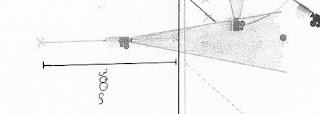
 The lead singer is positioned in the centre of the drawing above (croppped from the overal layour drawing). The two main shots we aim to create are the circular movement around the rear of the singer, which will expose the lights directed at him and the linar movement. The movement is just over 180degrees giving a chance to show the artists face whilest singing. On the day of the filming, the camera was positioned roughly 1.5metres from the artist. In order to settle with this distance we had to use time in class to judge several distances to see which was best.
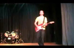
The movement required two cameramen, one controlled the direction of the camera by moving the pivot so that the singer was kept in shot at all times, the other dictated the movement of the dolly; making sure the distance from the artist was constant. Overall, it gave a smooth effect and a moment of the shot is pictured below. This moment of the shot is taken from when the camera was in the position marked in the drawing. The drawing also shows several other stages of the shot to give an impression of how the face of the camera movement throughout the shot so that JJ was kept in frame.
Next, we captured the other shot shown in the drawing. It is the linear movement the moves across the front of the artist and captured the other artists performing in the background. The movement was roughly two metres long and again the face of the camera had to be altered to keep the frame correct. There is no need for direction indicators on these drawings because we captured footage by doing each shot using different directions and then judged these shots when we had uploaded our footage to the computers. We can evaluate this shot by looking at the still from the music video thats pictured below.


Feedback From Group 04
Really good start, the video has a lot of nice shots with a wide range of angles. The footage fit the song well with a good conventional style. You just need to finish off the last bit and get some more locations as the hall bit is getting a little over played.
Overall - Wicked Cool!
Overall - Wicked Cool!
Tuesday, 3 November 2009
Extended Overnight Filming
Before we can complete the editing of our music video, we need to acquire all our footage. This includes capturing more close-ups of the artists and further footage that can amplify the relationship between lyrics and visuals. Firstly we had to arrange another date to film at either Sawston Village College or The Lock Up, our two filming locations. Due to the timely process of gaining further access to the SVC site, we decided it would be easier to film at The Lock Up. Finding a day that all group members could attend when the Lock Up was also available was fine. We settled with Monday 9th November 2009. This will last 2 hours.
In order to confirm this overnight filming session we will need to book the camera, a tripod, a light, a still camera and hopefully the dolly.
Our aims in this will be to film a vast amount of close-ups on each artist in turn. We can then synchronize the various close-ups with our soundtrack and create a professional perfected music video. Our causes for concern are to make sure we wear the correct costume to continue the idea of continuity. Also, we need to make sure the instruments we use are the same and that the location is replicated as best possible.
Furthermore, in listening to oral feedback from several viewers, we found that the structure of our music video needs close attention. The shot lengths appears to be correct but we've been advised to include more band footage, not necessarily through a performance, but highlighting the band and their daily lifestyle. If we wish to get a professional thematic edit we need to introduce the band and bring the dancing footage in a little later than we already have. Ideas of alternative footage can be acumliated through the music video to 'Falling In Love' by Mcfly which is displayed below.
In order to confirm this overnight filming session we will need to book the camera, a tripod, a light, a still camera and hopefully the dolly.
Feedback on Rough Cut
Feedback from Group 43
> We really like this video.> Good variety of shots which fit with the genre well.
> Liked how you involve the public in the improvised scenes.
> Good amount of lip-syncing which goes well with the 'live' atmosphere.
Feedback from Group 44
> The genre work is brilliantly worked out. You know what your doing with the genre which many have struggled to cope with but you have managed to pull it off well.
> You really need to put more close ups, more work on lip syncing your shots and making sure you got more performance shots. At the moment it comes across a bit like a appraisal I mean the ideas of shots outside of performance works but I think you got a few too many on it but they're pretty funny. (Y)
> You have a few great shots but you just need to use them more. More performance!
> Your selling yourself well at your end shots with the walking out. Just more work on shots showing all of you each having a face close up would work splendid.
Feedback from Group 47
its cool! evreything done, need to do the end better but brill. i liked the footage, the angles, the story line, the genre link, the goodwins points used very well... i agree with most of what the other people say, the double at the end needs doing again because it doesn't look good doubled, i like the home footage feel to it, it adds a really nice feel to it. The song is well sycned to the artist singing and you give the artist a really clear and good chance to be seen.
Feedback from Group 45
> Overall your roughcut video worked well, however it seemed as if there were too many locations making it hard to follow, because of this it did not flow as well as we think it could have done. But once the editing process has been carried out this should be improved.
> The pace of the video reflects the pace of the song and fits in with genre conventions.
> There are lots of varied shots particularly long shots that can be seen however we think the video would benefit from a few more close ups to sell the artist.
Well done :)
> There are lots of varied shots particularly long shots that can be seen however we think the video would benefit from a few more close ups to sell the artist.
Well done :)
Monday, 2 November 2009
Evaluating our Rough Cut
Goodwins Points
We felt that our music video complimented the genre characteristics of Alternative Rock. The amalgamation of performance footage and the collage of dance routines gives an effective use of genre characteristics. At this stage of the editing process, the majority of our footage is lip synced with the music from our lead singer. Other relationships between music and lyrics include the drummer playing through the line "Its okay to beat the living shit from the drum kit". We aim to improve the relationship by filming the footage we were unable to on our third day of our filming and therefore incorporate it in our music video. Currently, our relationship between music and visuals is quite strong. The lip syncing and synchronized instruments give an effective relationship, however most of the footage is not edited to the beat, this is because we're only at the rough cut stage of our editing.
 Our music video definitely sells the artist. There is a large amount of voyeurism as all the artists address the camera during the performance and this gives an impression that they are looking at the viewer. Finally, our intertextuality is from Blink 182 but we feel that we avoided the conventions of this music video when we filmed ours. We focused more on the performance aspect of the music video.
We felt that our music video complimented the genre characteristics of Alternative Rock. The amalgamation of performance footage and the collage of dance routines gives an effective use of genre characteristics. At this stage of the editing process, the majority of our footage is lip synced with the music from our lead singer.
 Other relationships between music and lyrics include the drummer playing through the line "Its okay to beat the living shit from the drum kit". We aim to improve the relationship by filming the footage we were unable to on our third day of our filming and therefore incorporate it in our music video. Currently, our relationship between music and visuals is quite strong. The lip syncing and synchronized instruments give an effective relationship, however most of the footage is not edited to the beat, this is because we're only at the rough cut stage of our editing.
 Our music video definitely sells the artist. There is a large amount of voyeurism as all the artists address the camera during the performance and this gives an impression that they are looking at the viewer. Finally, our intertextuality is from Blink 182 but we feel that we avoided the conventions of this music video when we filmed ours. We focused more on the performance aspect of the music video.