Monday, 14 December 2009
lolz
Good intro. Adressed questions. Well clarified. Loud enough. Nice hat.
feedback from 44
Then your whole work repeats again. O_O Sort it. :P
Anyways it's pretty original, your work was really entertaining to watch and your auteur work really shined well. Your different style plays with Indie really well, we admired your work and hope the best with this. (:
Feedback on commentary from group 45
Well done :) x
Commentary Feedback.
There is some continuity with your video as you kept changing in your music video and in this commentary, at first was distracting with wierd hats etc.
Thursday, 10 December 2009
Karl Final Evaluation
In many ways we’ve tried to make out music video effective by using common conventions seen in existing media products. Firstly, for example our music video is of the alternative rock genre because of this our video is mainly performance orientated which is key feature of alternative rock videos therefore making our video conventional. Furthermore, a secondary part of our video is the clips we’ve tried to include of everyday life. We have filmed in a music studio, out in town and on a stage. These locations try to promote the idea of fame and music promotion but also the shots in town promote the idea of our band being quite accessible. This links to Goodwin’s points of trying to sell the artist. The idea of following the band around in their everyday life can also be seen in ‘blink 182’s video ‘rock show’. The band can be seen walking around town together and this is what we have tried to capture in our video. This therefore means our video conforms to conventions. However on some levels are product does challenge the convention. There is no clear narrative, unlike some other videos of this genre which does make it slightly unconventional however, considering this it would have been very hard for us to break conventions. In the alternative rock genre most videos are quite experimental because of this, whatever we did in our video it would have been considered experimental and therefore conformed to conventions. In the terms of Goodwin’s points I feel our product does conform. We feel our video does convey our personalities well which refers to Auteur theory. This is a demand of the record label and does promote our band image.
2. How effective is the combination of your main product and ancillary tasks?
Overall we feel our ancillary texts and main product are quite effective together. We have tried to include on both our pieces information that will promote our DVD. Tour dates can also be seen on our magazine advert. To keep continuity between our pieces we have used the same backdrop, font and logos in our magazine advert as well as the DVD. We have picked these colour schemes because they are quite simple and they do not divert attention away from our main pictures which help to sell our artist. This links our pieces and makes them effective, they attract the audience into them by locking the viewer’s attention and because they look the same the audience is drawn in. Another way we’ve made our digi-packs effective is by showing a clear identity of our band. We’ve used lots of close ups in our video and tried to twin that with close up photos in our advert and DVD cover. Not only does this help with continuity but the images/close ups of the band help sell the artist. This is one of Goodwin’s points and ensures our products are effective. We have also tried to reflect the idea of auteur theory in our pieces. We have tried throughout to make our video and digi-pack as funny/playful as possible and we’ve to link this in the pieces therefore making them obviously belong to the same band and continuing our continuity. Unfortunately, there were obviously some negatives about our ancillary tasks. We feel as a group we did not leave the appropriate time for us to build our pieces. We had one lesson to try to make our products and our un-familiarity with Photoshop hindered us further. We feel if we could have had one of two more lessons we could have formed a much greater product. We could have included more relevant information and promoted our DVD further.
3. What have you learnt from your audience feedback?
From our first pitch for this video we have had many feedback comments. These comments helped us realise some good ideas for our video. They made us aware of what are target audience really wanted because they were the people giving us feedback. The main feedback we received from our pitch was generally how are we going to film the shots in town. This feedback made us consider our locations further and eventually decide how we were going to film our ideas. From our peer feedback on our rough cut piece we learnt that we needed to include more close ups in our video. This feedback was relevant because it was from our peers and are target audience. Bearing our feedback in mind we went back to our location for a second time and filmed some more close ups. These close ups were used to help build our band identity and were added into our final cut. Overall from the feedback we have learnt its important to leave enough time for a second day of filming as it became apparent to us, you do not always get all of the necessary footage in one shoot with regards to out digi-pack footage we feel we should have left more time for it as the overall products look very rushed. We failed to include everything we wanted such as drawing more attention to our DVD in our magazine advert. Therefore in retrospect to our feedback we have now learnt to schedule our work and leave more time for our bigger tasks. However overall, the most of our feedback was very pleasing. We had many good comments which were all positive.
4. How did you use new media technology in the construction and research, planning and evaluating stages?
Throughout the making and development of our product we have used lots of new technology. For example to host and keep track of our work we have been using a website, www.blogger.com. This website allows you to have your own blogs where you can record how your work is progressing in posts. It is very useful in keeping track of what you have done in lessons. You can host videos and pictures which enabled us to show all of inspiration in a simple, easy to access location. A second piece of technology we used to build our media product was a programme called Final Cut Express. This software is used when editing video footage. Final Cut is a very easy to use piece of kit and we all easily came to terms with the controls. You can add lots of different effects and with the marker tool available it was very easy for us synchronise our music to the visuals. Lastly, we used software called Photoshop. Photoshop is software which enables you to place a picture on another picture and add text onto it; with this we made our Digi-pack. We found this programme overall very hard to use. The tools were not easily explained and we found ourselves struggling to produce our products. Looking back at our pre-luminary tasks I feel we have come a long way especially with the use of final cut. Generally, over the two years of studying media studies I feel I have come a long way in filming and in producing products. I now feel very confident behind and in front or a camera and also I feel capable of using Final Cut editing software to make a good product. As we carry on our media course I hope to learn more about Photoshop as this is the one piece of software I feel most unfamiliar about.
Karl Lambourne
Scott Final Evaluation
Qu3. What have you learnt from your audience feedback?Our Audience feedback was very helpful and because of the feedback (from our teacher, class/group and some other members of our year whom are also taking media) we received on our rough cut, which we posted on our Blog we were able to perfect our final piece. For example, the feed back we received on our rough cut told us that our sense of comedy was noted which was good news to us as we were worried that it would only be us who found the shots funny due to the fact that we all knew each other, and that we needed to include more close ups as we literally didn’t have any which meant there was little lip syncing and the band was not very well advertised this was the only criticism. To combat this we went back to one of our performance area’s ‘The Lock Up’ and filmed close ups of each band member playing their instruments/Singing under many different filters of light and at many angles, which we then added into our final production using final cut. Feed back on the development of our final production after we had received the feedback on the rough cut then told us that we had improved our video drastically that the lip syncing was much improved and that overall we were now selling the band much more than previous. The feedback on our final product was very strong apart from on the ancillary tasks but we knew we had messed up on that part of the project, are feedback was not very strong for our ancillary task and there were many ways we could have improved it, for starters spending more time on it and adjusting the appearance to make it more eye catching. And should we be asked to produce a similar task again I would make sure for the first lesson the whole group write a plan of all the deadlines and what needs to be done in what order and the whole group stick to it as I feel this is where we failed to compete.Qu4. How did you use new media technology in the construction and research, planning and evaluating stages?During the planning and evaluating stages of this production we used many new media technologies, including Blogger.com which was a massive contribution to this stage of the music video, as we were able to plan it in college and at home by posting all of our brain storms, ideas, final plans and generally all contributions to the video in terms of planning, we found this very useful as it meant we were able to continue working on our product with easy access to all of our class work and it also meant we wouldn’t have to remember any ideas you had for the product should you think of them while your at home (e.g. while your watching a music channel on TV) you could just type them down onto the Blog. As part of our assignment it was asked that we try and get permission by someone relevant to the band, to produce a music video to the song (it didn’t matter if we didn’t receive a reply but we had to show that we had tried), we found an email on twitter.com which led us to the band manager ‘Jason Perry’ whom to our surprise replied to our e-mail and gave us permission to create a music video to the song. We used more, different media technology through the construction and research stages of the assignment; during research we again used blogger.com to note down our finds and post our work/ rough cuts etc which led us to be able to receive feedback and gave us a bigger foothold to create and evaluate the productions, google.com to research Digipaks for our ancillary tasks which proved very helpful for finding the conventions of alternative rock Digipaks (Similar to video conventions – more of a narrative photo of whole band after/during performance) and youtube.com which we used to sample videos of alternative rock production, as our song currently has no music video (that we could find) we based our video on videos by such alternative rock bands such as ‘Blink 182’ and ‘Sum 41’. These bands led us to finding the perfect conventions to make stand out in our production via looking at their more successful songs, which led us to a more performance and comic convention rather than a narrative. We also used the programmes ‘Final Cut’ and ‘Photoshop’ to create our whole Assignment, final cut was the programme we used to create the video, our skills have improved over the time we have been studying media and we were able to use the effectively to create a strong video including lip syncing, filters and small effects such as fades in/out. Photoshop was used only for the Digipak, which unfortunately none of our group knew how to use despite all of us been doing media for at least fifteen months. We used Photoshop for its layering of images and its many effects, sadly we only had one lesson to finalise our Digipak and due to our lack of knowledge around the programme we were unable to produce a strong piece, and out of the whole project I feel we let ourselves down on the ancillary task. To combat this problem next time I suggest that we either commit to spending more time on the programmes we do not know much about. Or we could take the time out (e.g. after lesson) to learn our way around the problems we do not know how to fix with the programmes. Our preliminary task was also very helpful in the technology side of this production, it helped us to remember the skills we has picked up In the previous year of media and allowed us to begin developing them for our main assignment, this was very helpful in all areas especially editing in final cut, as we were able to apply what we knew and then experiment with fades in/out etc in practice for our final product. Overall I feel we created a really strong media product and an effective assignment.
Final Evaluation
Our media product was of the alternate rock genre, and we took forms of other similar products, for example we were heavily influence by Blink 182 and Sum 41. We took characteristics from select videos, and portrayed them in our own. From studying 'Goodwin's Theory of Analysis', we were able to relate genre characteristics from other videos and adapt them into ours. A typical form we used from rock videos was: performance, and we used this for half of our product. And the other half was: lifestyle, we put this in for extra entertainment value to the audience, as the footage is quite comical. Our locations were conventional, as we used some band rehearsal rooms and a stage at Sawston Village College. By using these locations and then the town centre we were able to easily fit our footage around our genre specifics. I don't think we really challenged our genre, although the clip of us all climbing from the same box could be considered as uncharacteristic. We added this though for pure entertainment value as we wanted to reflect our personalities in the video, and we felt that alternative rock allowed us to do this. Otherwise we stuck to guidelines from our area, like the use of band mise en scene like instruments, and stage settings. The close ups of the artist, and complete artist focus, makes the band easily remembered. Through the comedy element of our video, we promoted the band with the comedic and relaxed atmosphere. By not having a crazed feel to the footage and transitions, we could draw the audience in to just enjoy the comedy without having to think too much. I would consider myself to be a member of our video’s target audience, and I think it’s attractive to watch because of its entertainment value. It vaguely represents shows like jackass, as it’s a fun and laid back viewing to give the audience a feel good viewing. We developed two sides of the video throughout, the performance and lifestyle sides, adding different clips from each side as the video progressed. There isn't an area where too many clips from the same side are stacked next to each other; we felt this would have the potential to bore the audience. The two real media products we based our video on were 'Rock Show' and 'In Too Deep'.
How effective is the combination of your main product and ancillary tasks?
I personally felt we could have done a lot better on our ancillary tasks, but if nothing else we did get the element of continuity between them, and between them both and our video. We used pictures from a shoot we did at The Junction to promote the band members, like we had done throughout the video. We chose this location as it’s a popular venue in Cambridge, which directly relates to our genre and promotes it; a lot of upcoming and popular bands play there. We kept to a basic background on both the DVD cover and magazine cover to vocalise the band, this way you'd easily be able to identify our ancillary tasks with the video. We also used the flaming A which is the bands signature, if the audience knew the band this would have appealed to them in particular. The products do however work together to promote one another, again through the same colour choices and continuity of the A and band photos. The advert doesn’t promote the DVD as strongly as it could have done, as we included tour dates also, which takes the sting out of the advert. But it does have reference for when the DVD is available, and the DVD then promotes the band by use of pictures that will be recognisable to the audience. We decided to go for a simple colour scheme quite simply because we didn’t have the right skills to get what we wanted into photo shop. I think we would have gone for a more elaborate, stand out background if we had the choice to show the extrovert sense to the band. The tasks do promote the same feel as the video also, that being relaxed and band focussed by being photographs of the band in their everyday lifestyle. The magazine article promotes the record label by visually aiding it on the décor. These adverts would appeal to a new audience as they promote the band and album in a way that would make the audience recognise the genre through the design and to listen to their music.
What have you learnt from your audience feedback?
Primarily we had to pitch for our song to the rest of the group, and our feedback from the pitch was pretty positive. They thought that the research we had done towards our locations and mise en scene would help in the future filming we would have to do. Although they did also say we would have to develop a stronger plot for our video, as our main ideas were a little bit scatty. Our feedback was mainly from members of the group, and Holly (media teacher). Although not all of them were relevant for our target audience, to study media we have had to learn to fit ourselves into any audience to be able to evaluate products more efficiently. We have all done a video preliminary so their knowledge was valuable to us. From our rough-cut feedback we gained a lot of welcomed knowledge. People thought we’d hit the nail on the head when shooting for our genre, and the amount of research we had done on location and props really helped the outcome of our video. But from the first lot of feedback we had also been given areas to improve on, and this was mainly to prioritise band members with close ups, and to only use long shots when they were really needed. To add to that we needed more lip syncing footage our vocals, we took all of these things into consideration when we went for our second footage shoot. The feedback we got was really helpful in order for us to make progress and produce our final piece. From our ancillary task we got feedback we expected, the other groups correctly analysed the problems with our pack that we knew were there but had no time to change. It was overall disappointing that we didn’t have time to change the things highlighted to us. If we were to do our main video again, we might get more valuable shots from the stage performance sides, as we looked a little unprepared and we were lucky to get the mise en scene there that was necessary.
How did you use new media technologies in the construction and research, planning and evaluation stages?
The main resources for the planning and research elements were the blog the media groups used and ‘You tube.’ These sites were of particular importance as they gave us a source for finding previous music video’s done at the college, and real existing ones. The blog was the entity of the project though, as this is where we published all of our planning, research, and anything else that came to mind in the lead up to our final product. Being able to see and talk about other videos whilst not in the classroom really helped us adapt our own ideas. With these sites as well, I was able to upload a video of me teaching the guitar parts to our group, so we could re-enact them better in our video. This proved helpful, as Scott isn’t able to actually play guitar. Another program that was essential for us to make any advance on our project was ‘Final Cut.’ This is a program that allowed us to merge, cut and add effects to the footage we had caught on our shoots. Our abilities using the program had been progressing as we continually used it in media, and this helped when chopping up long clips we had captured, most of which we didn’t use. A specific thing that has developed for me from AS is the use of markers in effect so you can get exactly what you want from it. The program we used for our ancillary task is called: ‘Photoshop’ this program was ill favoured throughout the group, as our ability to use this it wasn’t high. But from the experience I think we gained experience on how to use if we are ever called to again. Although it wasn’t our favourite piece of new media technology, it was essential to amalgamate our DVD and magazine add effectively. Last year, we did a preliminary task where we a short music video. This really prepared us for the main task, as it showed us just how much footage we needed to create our product. I think we advanced from the preliminary task as we used much more lip-syncing, and we related our music to visuals more effectively.
Sunday, 6 December 2009
Scott - Evaluation
‘Conventions’ is the term used to describe each different factor of a video/media production; similar to stereotypes they lead you towards what type/genre of media production you are watching. For example Alternative rock music videos consist of the following conventions – performance, comedy and a slight narrative. The song we chose (Pacific Ocean Blue by A) fitted with the alternative rock genre so we as a group were able to produce our product around the generic conventions. In our video we tried to use develop and challenge each of the conventions, we used a lot of performance shots which included us playing as a band in different locations (‘the Lock Up – Chesterton’ and ‘Sawston Village College Hall’) and in the same locations us playing our specified instruments singly in close up shots. We developed the comedy convention by massively implementing it, we did this by simply adding more comic shots such as ‘the box shot’ and us dancing with the public. During editing we tried to create the video with as much lip sync as possible while having as many comic shots as possible, this proved quite hard as every point where there was no singing and we wanted to add one of these shots we would find it difficult as we were trying to fit to on of Goodwin’s points ‘Relationship between lyrics and visual’. Our original plan to challenge the narrative convention was also disrupted by this point as we couldn’t leave out the narrative as we would then of missed out the point, to get around this we minimised the relationship between lyrics and visuals which became a very slight narrative. We know that the comic side of our music video worked from the feedback we received on our rough cut and we feel that we fitted our music video to the genre and conventions of alternative rock.
Qu2. How effective is the combination of your main product and ancillary tasks?
Overall we feel that our ancillary tasks and our main product worked quite effectively together. We tried to keep continuity between the two tasks, which I feel we did strongly, however our DVD cover and Magazine advert were very poor in terms of conventions, as we know we have failed to get them to the standard of the Main product. After we handed in our main product we spent too long evaluating it and writing on the Blog and before we knew it the deadline for the ancillary task was two lessons away, we spent one of these lessons taking photos for the task and the second lesson editing the photos on Photoshop, which concluded on us being very rushed for time. As none of us knew how to use Photoshop effectively this led to us becoming frustrated and effectively ruined our task. As we rushed to finish both the DVD cover and Magazine advert we ended up getting the information wrong and our magazine advert did not advertise our DVD, which it was supposed to of, We could have changed this by planning to spend more time on the task from the start of the project.
Qu3. What have you learnt from your audience feedback?
Our Audience feedback was very helpful and because of the feedback we received on our rough cut, which we posted on our Blog we were able to perfect our final piece. For example, the feed back we received on our rough cut told us that our sense of comedy was noted which was good news to us as we were worried that it would only be us who found the shots funny due to the fact that we all knew each other, and that we needed to include more close ups as we literally didn’t have any which meant there was little lip syncing and the band was not very well advertised. To combat this we went back to one of our performance area’s ‘The Lock Up’ and filmed close ups of each band member playing their instruments/Singing under many different filters of light and at many angles, which we then added into our final production using final cut. Feed back on the development of our final production after we had received the feedback on the rough cut then told us that we had improved our video drastically that the lip syncing was much improved and that overall we were now selling the band much more than previous. The feedback on our final product was very strong (apart from on the ancillary tasks but we knew we had messed up on that part of the project) and should we be asked to produce a similar task again I would make sure for the first lesson the whole group write a plan of all the deadlines and what needs to be done in what order and the whole group stick to it as I feel this is where we failed to compete.
Qu4. How did you use new media technology in the construction and research, planning and evaluating stages?
During the planning and evaluating stages of this production we used many new media technologies, including Blogger.com which was a massive contribution to this stage of the music video, as we were able to plan it in college and at home by posting all of our brain storms, ideas, final plans and generally all contributions to the video in terms of planning, we found this very useful as it meant we were able to continue working on our product with easy access to all of our class work and it also meant we wouldn’t have to remember any ideas you had for the product should you think of them while your at home (e.g. while your watching a music channel on TV) you could just type them down onto the Blog. As part of our assignment it was asked that we try and get permission by someone relevant to the band, to produce a music video to the song (it didn’t matter if we didn’t receive a reply but we had to show that we had tried), we found an email on twitter.com which led us to the band manager ‘Jason Perry’ whom to our surprise replied to our e-mail and gave us permission to create a music video to the song. We used more, different media technology through the construction and research stages of the assignment; during research we again used blogger.com to note down our finds and post our work/ rough cuts etc which led us to be able to receive feedback and gave us a bigger foothold to create and evaluate the productions, google.com to research Digipaks for our ancillary tasks which proved very helpful for finding the conventions of alternative rock Digipaks (Similar to video conventions – more of a narrative photo of whole band after/during performance) and youtube.com which we used to sample videos of alternative rock production, as our song currently has no music video (that we could find) we based our video on videos by such alternative rock bands such as ‘Blink 182’ and ‘Sum 41’. These bands led us to finding the perfect conventions to make stand out in our production via looking at their more successful songs, which led us to a more performance and comic convention rather than a narrative. We also used the programmes ‘Final Cut’ and ‘Photoshop’ to create our whole Assignment, final cut was the programme we used to create the video, our skills have improved over the time we have been studying media and we were able to use the effectively to create a strong video including lip syncing, filters and small effects such as fades in/out. Photoshop was used only for the Digipak, which unfortunately none of our group knew how to use despite all of us been doing media for at least fifteen months. We used Photoshop for its layering of images and its many effects, sadly we only had one lesson to finalise our Digipak and due to our lack of knowledge around the programme we were unable to produce a strong piece, and out of the whole project I feel we let ourselves down on the ancillary task. To combat this problem next time I suggest that we either commit to spending more time on the programmes we do not know much about. Or we could take the time out (e.g. after lesson) to learn our way around the problems we do not know how to fix with the programmes. However overall I feel we created a really strong media product and an effective assignment.
Evaluation
In what ways does your media product use, develop or challenge forms and conventions of real media products?
Our media product was of the alternate rock genre, and we took forms of other similar products, for example we were heavily influence by Blink 182 and Sum 41. We took characteristics from select videos, and portrait them into our own. From studying 'Goodwin's Theory of Analysis', we were able to relate genre characteristics from other video's and adapt them into ours. A typical form we used from rock videos was: performance, and we used this for half of our product. And the other half was: lifestyle, we put this in for extra entertainment value to the audience, as the footage is quite comical. I don't think we really challenged our genre, although the clip of us all climbing from the same box could be considered as uncharacteristic. We added this though for pure entertainment value as we wanted to reflect our personalities in the video, and we felt that alternative rock allowed us to do this. Otherwise we stuck to guidelines from our area. We developed two sides of the video throughout, the performance and lifestyle sides, adding different clips from each side as the video progressed. There isn't an area where too many clips from the same side are stacked next to each other, we felt this would have the potential to bore the audience. The two real media products we based our video on were 'Rock Show' and 'In Too Deep'
How effective is the combination of your main product and ancillary tasks?
I personally felt we could have done a lot better on our ancillary tasks, but if nothing else we did get the element of continuity between them, and between them both and our video. We used pictures from a shoot we did at The Junction to promote the band members, like we had done throughout the video. We chose this location as its a popular venue in
What have you learnt from your audience feedback?
From our rough cut feedback we gained a lot of welcomed knowledge. People thought we’d hit the nail on the head when shooting for our genre, and the amount of research we had done on location and props really helped the outcome of our video. But from the first lot of feedback we had also been given areas to improve on, and this was mainly to prioritise band members with close ups, and to only use long shots when they were really needed. To add to that we needed more lip syncing footage our vocals, we took all of these things into consideration when we went for our second footage shoot. The feedback we got was really helpful in order for us to make progress and produce our final piece. From our ancillary task we got feedback we expected, the other groups correctly analysed the problems with our pack that we knew were there but had no time to change. It was overall disappointing that we didn’t have time to change the things highlighted to us.
How did you use new media technologies in the construction and research, planning and evaluation stages?
The main resources for the planning and research elements were the blog the media groups used and ‘You tube.’ These sites were of particular importance as they gave us a source for finding previous music video’s done at the college, and real existing ones. The blog was the entity of the project though, as this is where we published all of our planning, research, and anything else that came to mind in the lead up to our final product. Being able to see and talk about other videos whilst not in the classroom really helped us adapt our own ideas. Another program that was essential for us to make any advance on our project was ‘Final Cut.’ This is a program that allowed us to merge, cut and add effects to the footage we had caught on our shoots. Our abilities using the program had been progressing as we continually used it in media, and this helped when chopping up long clips we had captured, most of which we didn’t use. With these sites as well, I was able to upload a video of me teaching the guitar parts to our group, so we could re-enact them better in our video. This proved helpful as Scott isn’t able to actually play guitar. The program we used for our ancillary task is called: ‘Photoshop’ this program was ill favoured throughout the group, as our ability to use this it wasn’t so. But from the experience I think we gained experience on how to use if we are ever called to again. Although it wasn’t our favourite piece of new media technology, it was essential to amalgamate our DVD and magazine add effectively.
Wednesday, 2 December 2009
Video Commentary Problems.
Evaluation 'POA'
We plan to have the four of us introduced individually, we plan to do this by having a short clip of each of us talking (a sentence or two about the music video) with our name on screen, then the clip will to all the four of us together in a room and we will answer the questions for the evaluation in a casual group discussion similar to a group interview.
Q 1: In what ways does the media product use, develop or challenge forms and conventions of real media products?
- Talk about 'Blink 182s' influence from their video 'Rock Show'
- Audience for alternative rock videos
- performance and lifestyle element of video
- we stuck to genre conventions
- how choices we made led to our final media product
- Goodwins theory and points that we used
Q 2: How effective is the combination of our ancillary task and our main product?
- how mise-en-scene was key to getting the photos relative
- our opinions on the DVD and Magazine covers
- representation and selling of artists
Q 3: What have you leant from audience feedback?
- open for discussion, talk about our camera work (Lack of close ups) etc.
- ability to communicate
- how we overcame these problems
Q 4: How did you use new media technologies in the construction and research planning and in the evaluation stages?
- how we have developed skills on final cut, photoshop and blog use
- how we uploaded examples of our genre from existing products via 'youtube' etc
- camerawork
Monday, 30 November 2009
Feedback from 44
Artist is promoted well.
Continuity through poster and DVD is good.
Spelling of blue is incorrect on the back of the DVD.
The band name is hard to work out on your digi back.
Digipack feedback
Digipack Feedback from Group 45
feedback
Friday, 27 November 2009
Digi-Pack turn out
Monday, 23 November 2009
Digipack Preparation
 This shoot will take place between 10:30 and 12:20 on Wednesday 25th November.
 Next we tried the same layout but the image was taken when the band (excluding the drummer) were closer to the camera and the overall distance between the lens and the artists was smaller.
Filming prep (late post)

Thursday, 19 November 2009
Digipack Example
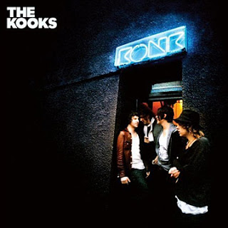 This album cover for The Kooks could be used as a template for our digipack. The genre is the alternative rock/indie rock which is the same as our music video, therefore we could use this album cover as a stimulus for our DVD pack.
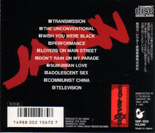
DVD Cover Ideas
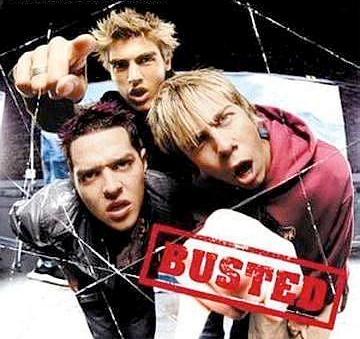 For our Digi pack we need to include a DVD cover and a magazine advertisement, above is the Album cover for busted. We chose this band because we feel they conform to the traditional rock formality, although we are aware that our msic video is alternative rock and Busted are more pop rock we still feel their Digi pack is appropriate to use as guidelines for ours.
To grab the viewers attention we need to:
- Include bright and catching colours
- Include good reviews from well known Critics i.e MTV etc.
To advertise the product we need to include:
- A Brand name
- A Release date
- Where it canbe purchased
- And official website such as a myspace or facebook page
- A Label with a good reputation
Extra Features that could be included would be:
- Promotional videos
- Bonus tracks
- Live Footage
- Tour Info
- Ratings
- Behind the scenes Photos and footage.
Dvd Cover, Magazine Advert By Karl
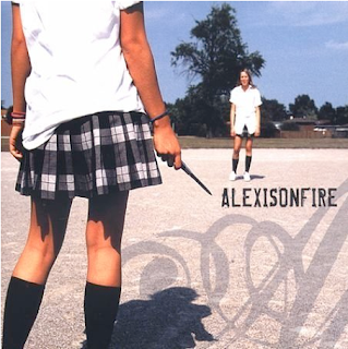 For our project it is a requirement for us to include DVD cover and a Magazine advert. For us to get an idea we need to look at existing examples to get a good idea.
This is the Album cover of the album 'Alexisonfire' by the band Alexisonfire. This album cover is for a slightly heavier genre of music than our piece. It does meet expected genre characteristics because it doesn't give much away and leaves the audience guessing about the content of the CD, Only existing fans will know. This however does look intriguing to new fans as they will want to find out more about it. There is a clear band name in easily readale format on the front which does premote the artist.
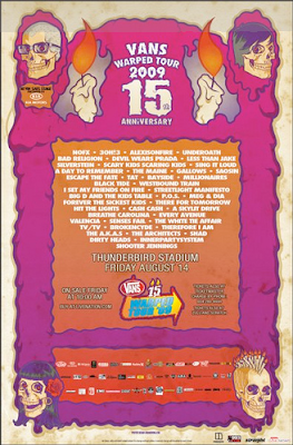
Across is the poster advertising the Vans warped tour 2009. This could be an example of what we're going to use but to promote our Dvd instead of a tour. This advert is good because it uses lots of bright colours. It gives the neccasary information and highlights the important parts.
Digi pack example


 This example of Bloc Party's album: Weekend in the city shows us some ideas that we could use on our own digi-pack. Although the genre of music is different we could at least take from the layout of the album cover and side.
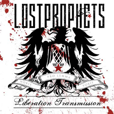
Our ideas are more band focused than this though and it should achieve public promotion through the band picture on the front, not only will the audience enjoy the music but they will also know each member and who they are listening too. Of course another possible idea would be to put out a logo that would be recognizable among fans like Lostprophets do on their cover of "Liberation Transmission"
 These ideas we could fit onto a DVD cover as well, but you'd expect to see more things such like tour dates and ratings from separate publications written on the back, and on the inside covers. here's an example of a DVD cover that will vaguely relate to ours.
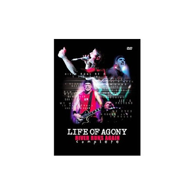 The title on this DVD cover gives us more examples of what we could do with ours, maybe create a font that is band specific. After looking for the band A's pictures we can see the pattern of text that we can try and imitate on our own digi-pack.
 Even though the Flaming A is not really to our taste imitating would be our best idea to make the digi-pack look professional. And in fact as you can see, this front cover is pretty much what we are going for with ours apart from we don't want to have the effect they do. We want the images to be naturalistic so the members are easily seen. But we have a lot of ideas to contend with when creating our digi-pack, and we also have some photos to take.
Another thing we have to think about is special features here's an example of special features from another DVD
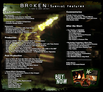
We could have things like:
-Band Commentary
-The shooting of the video
-Lyric sing along
-Pre-Production
These are all things we can consider when producing the back of our DVD.
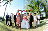
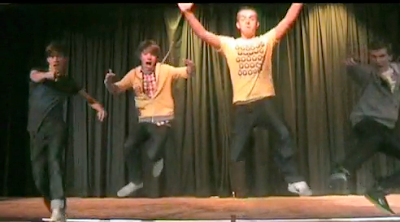 A photo like this is what we'd be going for for our digi pack. We wont be using this one as we want to have a proper photo shoot with a better camera, but something that catches all the band, without instruments, behaving how they would in everyday life, but we might experiment with posing pictures also.
Feedback from group 37
Wednesday, 18 November 2009
Feedback on Final Cut
Monday, 16 November 2009
Digipack Development
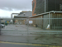 Using the junction as our location would highlight the celebrity status of our band and could be used as a theme for our magazine advert. We brain stormed ideas that included having people posing as paparazzi and the band wearing sun glasses to suggest the reputation and fame of the band.

Wednesday, 11 November 2009
Penultimate Editing lesson
Tuesday, 10 November 2009
After Hours Editing
Monday, 9 November 2009
Filming at the "Secret Location"
we made it look as if we were all climbing out of the same medium sized box by choosing when to stop and roll the camera, and by using this technique we were able to make it look as if we had all started in the same area.
Final Cut Progress
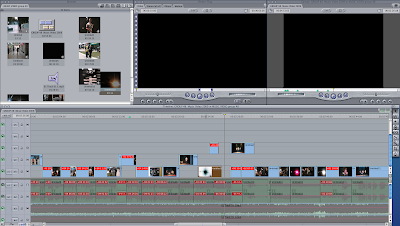 This is what our video looks like in the editing process right now. We have a lot of out of place footage and a lot of unused sound, although when we convert it to quick time this wont cause any problem. We need to sought out all the footage that we're using add effects and lap over only when we need to.
Sunday, 8 November 2009
Feedback from Target Audience
Thursday, 5 November 2009
Test Footage 2 (scott wrote this)
After evaluating our existing footage and our feedback from our teacher and other groups, we felt it necessary to obtain more band shots and close ups. Consequently we ventured around long road and found a secluded location and set to filming.
We feel these shots may be used to fill some of our gaps and will help to build our band image and could be evolved in our digi pack. Our footage includes us walking down a set of stairs (leaving the stage) at several different angles which evolves continuity. And a continuous shot of all four band members climbing out of a box as if we were all in there together.

Location Angle Shot Settings
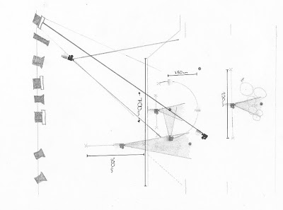 We had to decide on the angles of shots at the location. To take full advantage of the lighting system we had at our discretion at Sawston Village College, we took ideas from previous music videos that used a stage performance or concert (as shown in the Moodboard post) and produced a professional looking shot. From the drawing of the location below it shows the eclipse we made between the colour scrolling light, the artist and the camera.
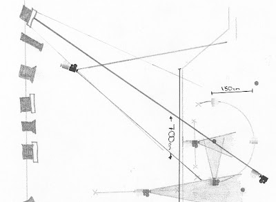

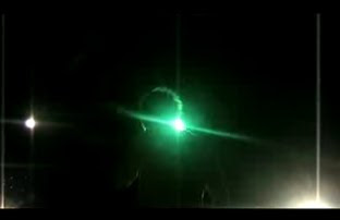
This gives a silloette impression of the artists and shows the performance side of the music video. The area covered by the colour scrolling light is shown in the drawing. The picture below is cut from our rough cut and it shows the effect given.
Contradictions
With these things put into action we hope the overall result will look a little more professional, and contain more variety.
Wednesday, 4 November 2009
Location Settings
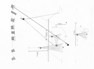 The blocking was simple when it came to artists positioning on the stage. The famous conventional layout of an alternative rock concert is prominant in every stage music performance due to the musical requirements on a stage, this means keeping the drumkit upstage so that the vibrations can resonate with the space above the stage and doesn't drown out the sounds of the other instruments. An example of this layout is used in the final performance of 'The School of Rock' as pictured below.
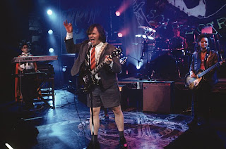
The lead singer is at the front, leading the piece and the two guitarist are kept slightly upstage, either side of the singer.
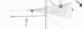
Firstly, we can see the camera movements we aim to create of the lead singer.
 The lead singer is positioned in the centre of the drawing above (croppped from the overal layour drawing). The two main shots we aim to create are the circular movement around the rear of the singer, which will expose the lights directed at him and the linar movement. The movement is just over 180degrees giving a chance to show the artists face whilest singing. On the day of the filming, the camera was positioned roughly 1.5metres from the artist. In order to settle with this distance we had to use time in class to judge several distances to see which was best.
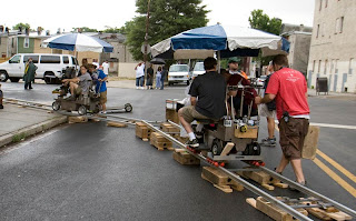
The movement required two cameramen, one controlled the direction of the camera by moving the pivot so that the singer was kept in shot at all times, the other dictated the movement of the dolly; making sure the distance from the artist was constant. Overall, it gave a smooth effect and a moment of the shot is pictured below. This moment of the shot is taken from when the camera was in the position marked in the drawing. The drawing also shows several other stages of the shot to give an impression of how the face of the camera movement throughout the shot so that JJ was kept in frame.
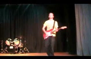
Next, we captured the other shot shown in the drawing. It is the linear movement the moves across the front of the artist and captured the other artists performing in the background. The movement was roughly two metres long and again the face of the camera had to be altered to keep the frame correct. There is no need for direction indicators on these drawings because we captured footage by doing each shot using different directions and then judged these shots when we had uploaded our footage to the computers. We can evaluate this shot by looking at the still from the music video thats pictured below.
